About TAP Air Portugal
TAP Air Portugal is Portugal’s leading airline and a member of Star Alliance since 2005. Flying since 1945, TAP operates from its Lisbon hub, connecting Europe with Africa and the Americas. The World Travel Awards have consistently named it Europe’s Leading Airline to Africa and Europe’s Leading Airline to South America.
TAP’s fleet includes next-generation NEO model Airbus aircraft, alongside a regional fleet of Embraer and ATR aircraft under TAP Express. It’s widely recognized as one of the safest airlines in Europe and the world.
For a company handling millions of bookings online, even small friction points in the digital experience carry real cost. TAP uses Wingify to test and fix them.
Why Wingify?
TAP Air Portugal chose Wingify as its experimentation platform to support a data-driven optimization program across its digital booking journey. Wingify enabled the team to quickly create, launch, and measure experiments on critical booking funnel pages, helping identify opportunities to reduce friction, improve user experience, and increase engagement without requiring extensive development effort.
 Bruno Vilan SEO & CRO Analyst

Goals
Increase visibility and engagement with the login functionality on the TAP Air Portugal website by making the login entry point easier to identify. The objective was to determine whether adding a clear text label to the existing login icon would improve recognition, drive more clicks on the Login CTA, and encourage more visitors to access their accounts during the booking journey.
Observations
The header login element used only an icon, with no accompanying text label. Visitors unfamiliar with the icon might not recognize it as a login entry point, potentially reducing engagement with the feature.
Tests run
The team ran an A/B test using Wingify Experimentation on the TAP Air Portugal homepage.
Hypothesis
If the login element in the header included a visible “Login” text label, either alongside the icon or as a standalone label, visitors would more easily identify it as an actionable entry point, resulting in more clicks on the Login CTA.
Changes Implemented
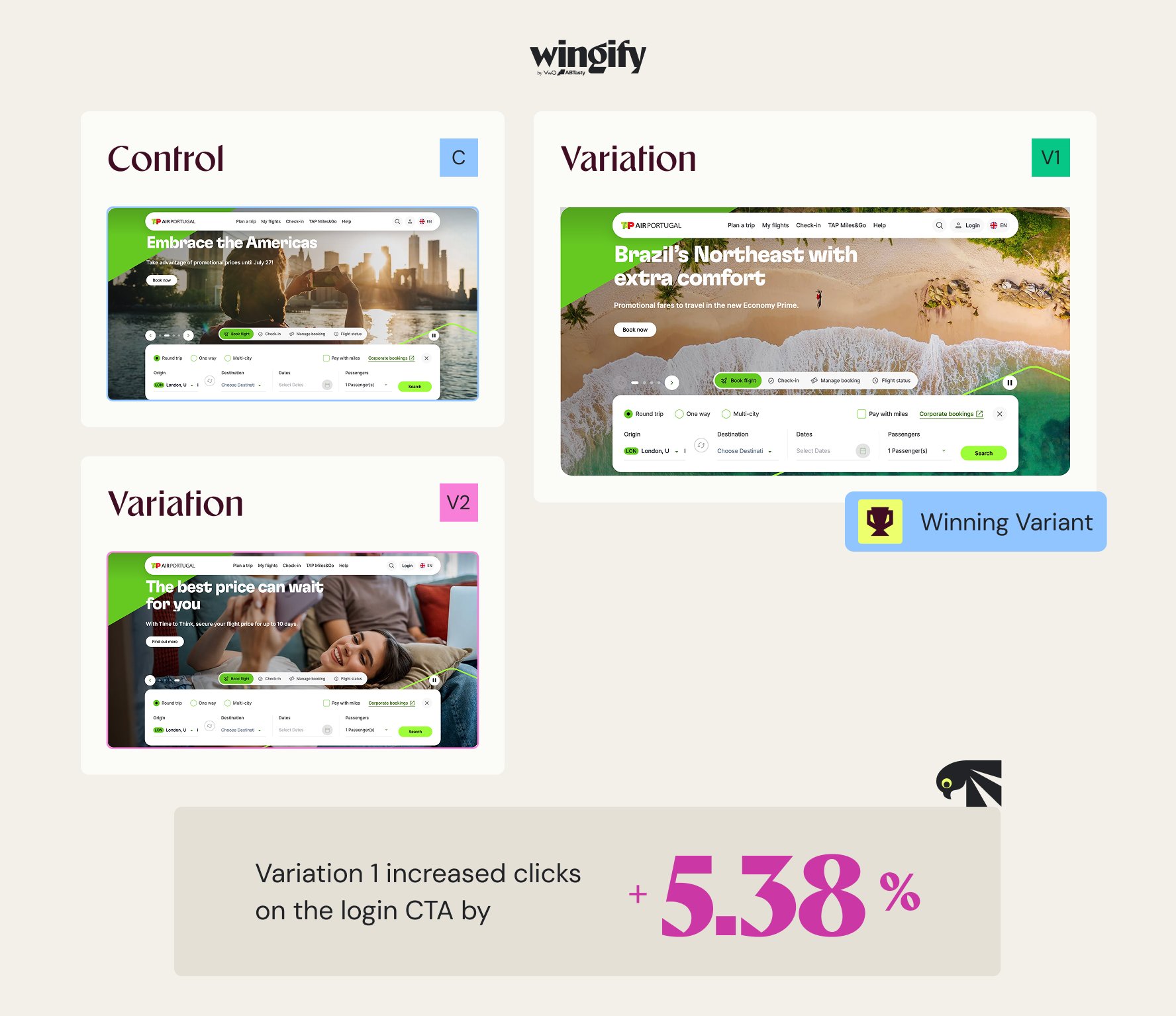
The control displayed only a person icon in the header navigation, with no text label.
Variation 1 added a “Login” text label next to the icon, keeping both the visual and the text elements together.
Variation 2 removed the icon entirely and showed only the “Login” text label, testing whether the text alone was sufficient.
Results
Variation 1 won, and clicks on the login CTA increased by 5.38%, confirming that the icon alone was not doing enough to communicate the action to all visitors.
Overall impact
5.38% increase in login CTA clicks
+ 5.38%
Conclusion
The results validated the hypothesis that explicit labeling can reduce ambiguity and helps visitors identify available actions more easily. Based on these findings, TAP will implement the icon-and-text combination as the default experience to improve account access visibility and increase engagement with logged-in user features.
Small labels changed the outcome here. What’s the equivalent change hiding on your pages? Book a free Wingify demo and go find it.