Wingify and Understand Quran Academy
Understand Quran Academy offers interactive courses that explain Islamic religious texts to people.
They used Wingify to run a simple A/B test.
Goals: Increase Sales
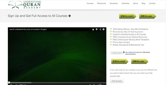
Customers could choose between a $10 monthly plan or a $99 annual plan on its sign-up page. The page listed 7 ways in which it delivered value to its customers.
This is how the original page looked:
Understand Quran Academy VWO Success Story Control
100% Money Refund and iPhone App included were considered 2 important elements for customers. The team believed that highlighting these elements on the page would help increase sales.
Tests run: Prominently Display Features and Benefits So Visitors See/Read Them
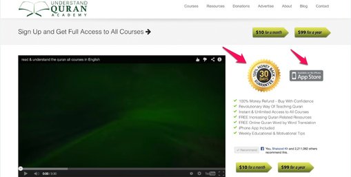
UnderstandQuran.com created 2 icons to represent the 100% money refund guarantee and the Apple app store and placed these prominently on the sign-up page. Using Wingify, they ran a simple A/B test to see how these icons impacted sales.
This is what the variation looked like:
Understanding Quran Academy VWO Success Story Variation
The test ran for 11 days.
Overall impact
+ 33%
Conclusion: 32.57% Increase in Sales
The hypothesis was proved, with the variation generating 32.57% more sales than the control. The results had a statistical significance of 98%.
As conversion optimization specialist Maruf Yusupov, representing UnderstandQuran.com, said, “I have seen many other cases where highlighting risk-free Guarantee icons worked so I wanted to try on this company too.”
The 30-day Money Back Guarantee icon convinced more prospects to sign up by allaying potential customers’ fears regarding the purchase; it eliminated one of the biggest barriers to conversions—perceived risk. While the Guarantee icon took care of a potential customer’s skepticism, the Apple Store icon assured prospects (at least those with iPhones) that they could access content even on the move—a convenience benefit.
There are 2 takeaways from this test that can be called best practices:
1) Say it out loud.
No matter how hard-to-resist your discount offer or how compelling your value proposition is, it means nothing unless your customers are aware of it. The Money-back Guarantee and App features were already part of the text on the sign-up page.
But as Maruf Yusupov said, “We wanted to test if there is a positive impact if we highlight them. It seems there is.”
2) Display it prominently.
If you have decided what value elements you want to highlight and how, place these at a strategic position on the page to attract maximum eyeballs.
UnderstandQuran.com placed the icons in a way that these did not disrupt the natural eye flow. They made the icons larger than the call-to-actions (though not a best practice), which ensured that visitors see the guarantee icon before the call-to-action buttons. Also, the orange color of the Guarantee icon stood out in contrast to the green color of the CTAs and was hard to miss.