Free Tool
AI-powered free heatmap generator
Get delivered to your inbox a predictive visual representation of how visitors are likely to interact with your webpage!
Your heatmap is being generated
You will receive it in your email in a couple of minutes.
In the meantime, let’s learn more about heatmaps!
Heatmaps
Heatmaps are a color-coded graphical representation of visitor clicks in the form of a map or a diagram. Page elements are represented as hotspots based on clicks received on each page element.
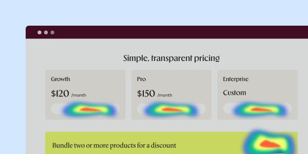
Digest a large volume of data
Heatmaps help the human brain easily read and digest large volumes of data within seconds and instantly take decisions. Their self-explanatory and highly intuitive nature further makes them a great and must-have qualitative tool in your arsenal.
Color spectrum in heatmaps
Warm-to-cold spectrum (red-orange-yellow-green) is the most common color hue used to create a heatmap. The warmest colors, i.e., red and orange, represent the highest visitor engagement (in the form of clicks), while the coolest, yellow and green, indicate the lowest visitor engagement areas.
Visitor-interaction insights
This powerful and efficient diagnostic tool helps you uncover visitor-interaction insights, highlights bottlenecks and guides you through the entire optimization process.
Heatmaps is a feature of Wingify Insights
With Wingify Insights, you can get much more than heatmaps to make your visitor behavior understanding more robust!
Session recordings
Track how visitors interact with your website, frame-by-frame.
On-page surveys
Ask the right questions to your visitors with on-page surveys and use the gathered insights to improve your website’s performance.
Scrollmaps
Find out visitor scrolling patterns on your webpage and analyze how to optimize for user scroll depth.
Funnel analysis
Map the actual journey of your visitors throughout your website and see where they drop-off or convert into paying customers.
Form analytics
Analyze the performance of your forms. Find out how visitors interact with them, what the friction areas are, which fields they fill in first, and so on.
Use Heatmaps and Wingify to understand your website visitors